Large Financial Client* has multiple enterprise and consumer facing products. Each product has its own branding externally but sends users back to its internal sites. This causes user confusion because visual systems are inconsistent. Because each visual system is custom built, developers are spending a lot of time building out each feature and 3 sprints behind design.
My goal was to design a React-based component-based UI Toolkit that will help create a better user experience across products and save developer time.
Design Systems
UX Design, Interaction Design, Visual Design

Project Brief
Timeline: 6 months
Team: 1 UXD, 1 Visual Designer, 1 UXR, 1 Product Manager, 2 Developers
Requirements:
Brand Kit
React-Based UI Component Library

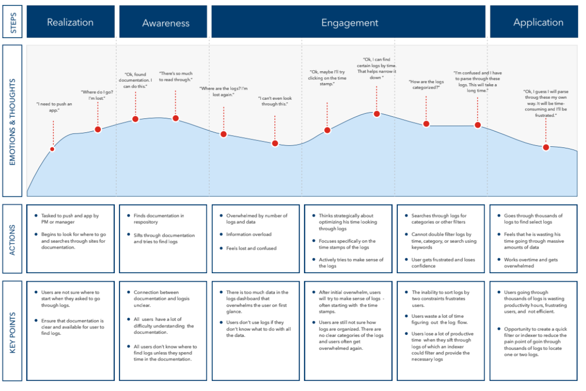
Affinity Map
Example from engagement
Jobs-To-Be-Done
Examples from Project

Critical User Journey
Example from Project

Workshops
Facilitated alignment through dot voting to identify which components developers, product, and designers agreed were the most important.
We identified Foundational Typography and Colors, Cards, and Interactive States.
Project Constraints
Our first Component Toolkit was in Powerpoint and highly usable across the bank because the accessibility of Powerpoint. Design tools such as Figma, Sketch, Adobe, and Invision were not introduced until the next year because of firewalls.
While only designers had access to design tools, we began to move components to Sketch over the course of a year.


