INTERACTIVE/BRANDING RE-DESIGN
TRIBECA
PLATFORM: WEBSITE + PRINT
BACKGROUND:
The task was to rebrand a neighborhood in New York. I selected TriBeCa.
LOGO EXPLORATION:
I began my branding process by looking at different logos that would reflect the elements of Tribeca. Because Tribeca stands for "Triangle Below Canal", I decided to focus on a triangle element and modern typography.
Final Logo Design
BRANDING GUIDELINES:
To determine the look and feel of Tribeca, I identified a few photos that reflected the vibe of the neighborhood. I honed in on the film element. Filming is evident in Tribeca because I often walked into film sets on the cobblestone streets, famous movie stars live in TriBeCa (DeNiro), and the Tribeca Film Festival takes place in the neighborhood.
Blues and oranges were selected because Tribeca is next to the blue water and has a tint of orange from the old lofts.
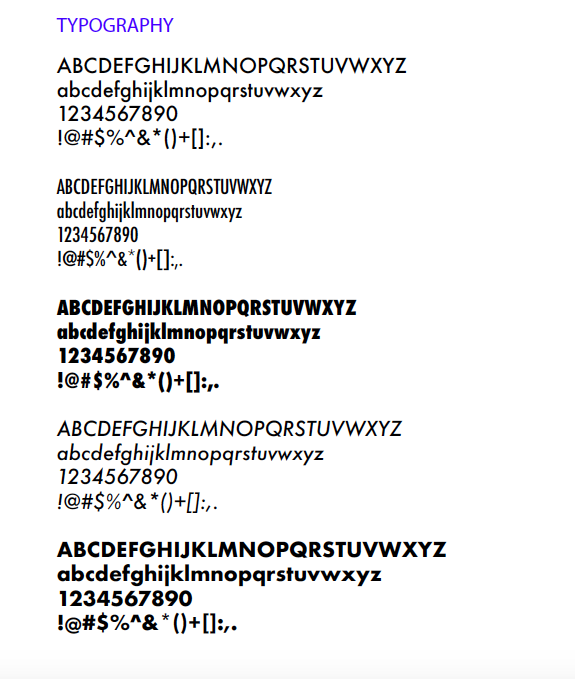
In terms of typography, I landed on modern typefaces that were sans serif because Tribeca Film Festival's brand has an ultramodern feel.
TESTING: BUSINESS CARDS/STATIONERY
When I tested the logo on business cards, the logo became the focus. Names and other information were secondary in the visual hierarchy of the card.
To hone in on the logo, I explored designing the logo on a tote bag. On the tote, the logo worked with a slant, which showed further angles that I could explore the brand.
For the full stationery mockup, I discovered that my logo would work on both light and dark backgrounds. Also, I would have to explore lighter shades of blue that weren't so overwhelming.
TESTING: POSTER + WEB BANNER
When trying out the logo on a poster, I discovered the translation of the elements. Having only triangles would weaken the Tribeca brand. Looking closer at the web banner, I noticed that rectangular elements were a subtle visual cue --a nice highlight to the brand.
Testing: Brochure
My design system came to life during my brochure exploration. My triangles became a highlight in the design language. The rectangles served as text overlays that would communicate to the reader in Futura.
WEBSITE DESIGNS:
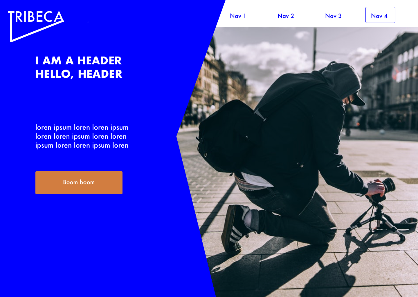
From my exploration with triangles and rectangles, I decided to hone in on the two shapes. To stay true to Tribeca, I utilized the triangle elements more visibly as as focus point. The rectangle elements reflected the old lofts in Tribeca, and I used the shapes as a highlight.
Wireframing brought out ideas for our Home Page.


